| Summer Show 2011 | ||||
 |
 |
 |
 |
 |
 |
Adam Nicholls - Swift Sportswear For this assignment I am going to brand and advertise a pair of trainers and by doing so I am going to stress the purpose whether this be a literal or abstract idea conveying speed, comfort, distance etc through imagery. This will include making a logo which will feature on the side of the trainers, once the trainers are branded and I then have the image of the trainers which I can then apply this to a poster and web site which may be implied in a different way through manipulation. I think it is essential to create the logo first and to go in chronological order as this then will create the personality of the trainers. By having a unique selling point of the product it allows the design to go down that route opens up more ideas for possible outcomes which will give it that professional factor and separate it from the rest. With the target audience being for sporting people I need to emphasise this as well as I can in the advertisement this may by showing what they can achieve by using this product. First of all I need to research existing successful sporting companies and see how they have gone about it and analyse why it is successful and what makes mine different to theirs.
|
I am going to do a thorough examination of logo’s by having a broad look analysing and then narrowing down to more appropriate examples this is so that I can see what is successful and how they have conveyed their unique selling point to their logo. I am also going to do the same with the advertising as a basis and scale down by viewing existing sporting companies and see how designers have stressed the USP by researching into design agencies such as ‘Ars Thanea’, designers like ‘Alex Trochut’ and galleries on websites like ‘smashing magazine’. When designing all of this I will make sure that it is all consistent by having the same theme throughout this will be done by having the poster the same as the web site by colour and design. I am going to combine different types of media in this, mainly photography with Photoshop and Illustrator. I think that photography is going to pay a key part in this as it is the photo that is the focal point and the rest, whether this be vector is going to enhance the appearance of the focal. But before this I am going to do many sketches of logo’s and final outcomes to give myself a wider range of choice to get that stronger final piece. I am going to assess and analyse my own and other peoples work to see if we have achieved what has been set and if we have achieved the maximum potential of what can be done. As strangers to their brief and challenge set it allows us to see how they have stressed what they have done to show their work and this makes us think of how we can show our work that they are unfamiliar with so they know exactly what has happened through the process. |
|
 |
 |
||
| - - - - - - - - - - - - - - - - - - - - - - - - - - - - - - - - - - - - - - - - - - - - - - - - - - - - - - - - - - - - - - - - - - - - - - - - - - - - - - - - - - - - - - - - - - - - - - - - - - - - - - - - - - |
 |
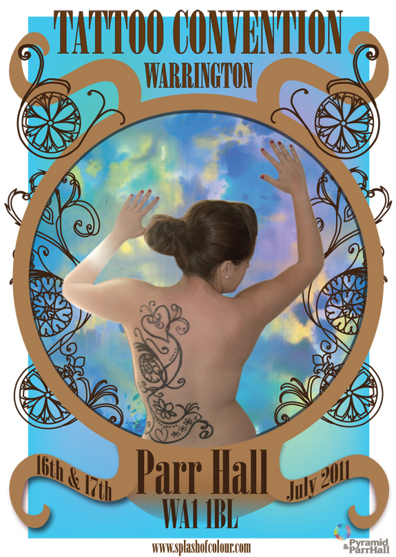
Charlotte Cooper -Tattoo Convention For my final major project assessment I decided to promote a new tattoo convention in the North West. I decided to do this for my project because I work in a tattoo studio and I am interested in tattooing. I started off by brainstorming tattooing in general such as the designs and everything to do with tattooing like the equipment. I designed a poster, business card, leaflet and logo for the tattoo convention. I wanted a main theme for the convention so I did some concept ideas of what the theme could be. One of my ideas was about commitment and how having a tattoo is on you for life so you will have to be commented like marriage or having children. I decided not to go with this idea because I thought it would be quiet hard to get the imagery together and if I shown a bride covered in tattoos I wouldn’t want to put people off coming to the convention. I also had ideas of tattooing older people like a grandma or grandad this would have shown a funny side but I decided not to go with this idea because I wouldn’t be able to tattoo my grandma in reality. I then went to a tattoo convention in Manchester to see how everything was lay out and what went on during the day. I realised that more women were there then I thought there would be. This then gave me the idea of trying to attracting more women to conventions and to become tattoo artists. I looked at several illustrators that we’re very feminine such as Charlotte Day, and Nadia Flower. I thought both of their work was feminine because they both used floral designs and patterns which I could be inspired by for my final development. I also looked at a free lance artist called Eric Van Den Boom. His work was very interesting and very attractive with the bright colours he used though out his work. I liked his work but decided it wouldn’t work well with my idea of attracting women. I researched tattoo designed that have done on woman to get an idea of what sort of imagery I could use in my final work. I found that flowers, swirls and love hearts were very popular. I took some primary images of the tattoo equipment to show ideas that I could use. I also took primary images of flowers. I didn’t use these images in the end because I manage to get some better one further down the development stages.
|
 |
|||
| I found a body illustrator called Emma Hack. She drew floral patters and designs on to the body that matched the wall paper behind so it looked liked the body was blending in with the wall. Her work is very interesting and inspired me to another idea of body painting. This could be like tattooing but not permanent. I decided that I wanted to draw up a design and paint it on to a friend and then I could use the imagery on my final poster. I thought of different placed where I could have the tattoo convention and I wanted to hold it at the Parr Hall in Warrington this then gave me the idea of the main features of Warrington. I did a brain storm of the main features of Warrington and the golden gates were the most decretive. I went and took some primary images of the golden gates I got some close up ones to show all the different patterns on them. I then drew up a tattoo design using the images to be painted on to my friends. I looked at Nadia Flowers work to help me design the tattoo by using a layout of one of her pieces. I was happy with this and arranged a day where |
I would paint on my friend and take some images. This turned out really well and I was happy with the imagery that I got. Then put them on to the computer for editing. I looked at several tattoo convention poster that had already been designed. I looked at each one and picked out what I liked and what I didn’t like to get ideas of what I wanted my poster to look like. I found out that using more than two font styled made the poster look less professional and several other things I wouldn’t have on my poster. I started the development of my poster it took me a while to design the poster how I wanted but I got there in the end. I started off by doing a simple background. I chose which image looked best from the photo shoot I did with my friend and her back design. I then added this to the poster and work around it. I drew up some vector imagery to add depth to my poster. I also added the tattoo design that I drew up because I had previously scanned that into the computer so I could add it to my work. I got my final poster and I was very pleased with the final outcome. |
||||
| - - - - - - - - - - - - - - - - - - - - - - - - - - - - - - - - - - - - - - - - - - - - - - - - - - - - - - - - - - - - - - - - - - - - - - - - - - - - - - - - - - - - - - - - - - - - - - - - - - - - - - - - - - |
 |
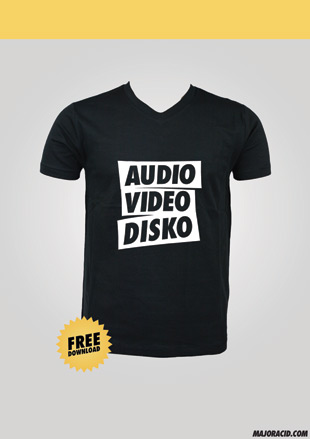
Ellis Gayle - majoracid.com For my Final Major Project, I will be designing and creating a website described as an ‘Interactive Music Community’. I have described the website as an ‘Interactive Music Community’ because the website will be fully interactive, entirely focused on music, and recognised as a large online community. The main theme I will be working with during my development and production will be ‘Sharing’. The website aims to share music to its community, and this will have heavy influence on the designs. The website will be called Major Acid. Alongside the production of the website, I will coordinate designs to advertise and promote the website, and design the corporate identity of the organisation. I aim to produce one fully functioning ‘Beta’ flash-based website, one A0 composition print, as a promotional poster for the website and services, a selection of leaflets to be displayed as advertisements, a ‘monthly’ collectible promotional mix tape CD complete with designed artwork. I also have aims to design a range of t-shirts which may be bought from a store, of which will not actually be built inside the website. When I come to design the corporate identity of Major Acid I will draw early influences from my wide range of research of artists such as David Airey and Paul Snowden. When I am preparing the design and functionality of the website I will reference and seek influence from many similar market sites such as beatport.com, grooveshark.com, and prominent music blogs such as gottadancedirty.com, toomanysebastians.net and music delivery services/blog aggregators like hypem.com and elbo.ws.
|
|
|
   |
|||

| - - - - - - - - - - - - - - - - - - - - - - - - - - - - - - - - - - - - - - - - - - - - - - - - - - - - - - - - - - - - - - - - - - - - - - - - - - - - - - - - - - - - - - - - - - - - - - - - - - - - - - - - - - |
 |
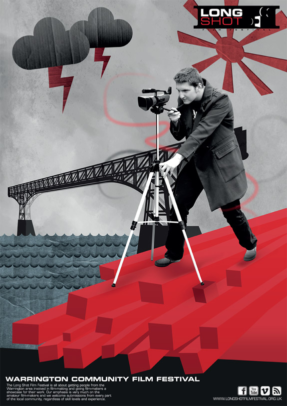
Daniel Sim -Long Shot Film Festival The Long Shot Film Festival is all about getting people from the Warrington area involved in film-making and giving film-makers a showcase for their work. We welcome submissions from every part of the local community, regardless of skill levels and experience. Entries are now open for the 2011 Long Shot Film Festival and the Long Shot submission form and guidelines are available for download. A selection of films from the 2009 and 2010 film festivals is available to view online, to help give you an idea of the work we showcase. If you interested in hiring equipment to help you complete your 2011 Long Shot Film Festival entry then find out how we can help
|
|
 |
||
| - - - - - - - - - - - - - - - - - - - - - - - - - - - - - - - - - - - - - - - - - - - - - - - - - - - - - - - - - - - - - - - - - - - - - - - - - - - - - - - - - - - - - - - - - - - - - - - - - - - - - - - - - - |
 |
Hannah Jones - Identity Theft The theme that I have decided on for this assignment is Public Awareness, and more specifically Identity Theft. For this I will first produce a logo that will be part of a hypothetical brand campaign to create awareness for my chosen theme. These will appear on promotional items such as posters and brochures/leaflets and promotional merchandise such as T-shirts. I will also brainstorm more abstract ideas for advertisement/promotional ideas which will enable me to produce something more eye catching than usual techniques.
|
For my main imagery I will look at all of the different available media and techniques for producing my designs but will focus more on producing vectors as I feel it will enable me to produce successful designs. The end result I see in the future of my project is a set of advertising imagery, for this I will need to produce eye catching and interesting work. I believe that using vectors is best for this because it is easier on the eye than ordinary primary sources. The vectors I produce will be from my own primary sources and I may even combine the two together depending on where my concepts lead me to. To influence me in my designs I will look at illustrators such as Claire Rollet who works with putting primary source images of people onto a vector background to look like they are living almost in a vector world. Similar to Ella Tjader’s work, Rollet’s is rather feminine, although both illustrators work are relevant to my theme. I will look at the work of other illustrators such as ‘Stik’ who works with simple vectors that are effective because of the smaller amount of detail. I will research into already existing Public Awareness Campaigns for my theme and other relative themes, to inspire myself and get some early ideas for when I start to brainstorm my concepts.
|
|
 |
 |
||
| - - - - - - - - - - - - - - - - - - - - - - - - - - - - - - - - - - - - - - - - - - - - - - - - - - - - - - - - - - - - - - - - - - - - - - - - - - - - - - - - - - - - - - - - - - - - - - - - - - - - - - - - - - |
 |
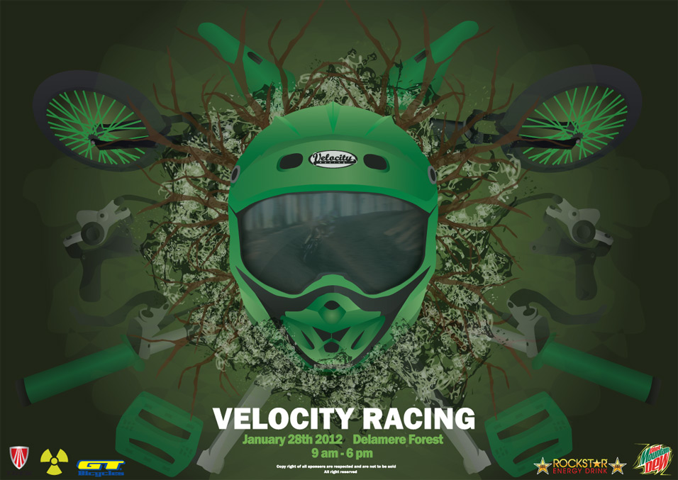
Daniel Meigan-Watts - Velocity Racing Downhill Event For my project I have decided to create a down hill bike race event, this will include a poster, flyers and a video advertisement. I chose to do a down hill event because it is a fast paced sport in which I hope to capture a perfect shot that will show great detail and show just how great it is. After researching on the internet for a while I found a photographer who specializes in down hill racing photography and his name is Seb Rogers. He has taken hundreds of pictures ranging from bikes racing down hills to shots of equipment used for racing such as helmets and GPS. I shall start of by completing 2 brainstorms for what type of angles to take the photos on and how I shall place the objects in the shot.
|
I will also research previous photographs to see how I could position mine and I would like to experiment with different types of shots. Some early ideas have already come to my mind such as a close up of a bike as it turns sharply round a corner, dust will be kicked up from the tyres and I would like to get some shots of trees and slightly blend them into the background In order to get the shots I want I will have to do some planning and work out the timing for when it is best to take the picture. I would like to create an advertisement to draw interest to my event and present it on a projector, I will do this by attaching a camera to different parts of the bike and also on the helmet to give the view different views of how exciting and fast paced down hill racing is. I will use a high definition camera to capture the action. An action plan is necessary to determine the amount of time that I should be spending on each part of the process. My first week’s task will be to take primary sources, complete the brainstorms and produce some initial ideas. I will evaluate my project by showing a presentation and by taking part in a self and peer review. |
|
 |
|||
| - - - - - - - - - - - - - - - - - - - - - - - - - - - - - - - - - - - - - - - - - - - - - - - - - - - - - - - - - - - - - - - - - - - - - - - - - - - - - - - - - - - - - - - - - - - - - - - - - - - - - - - - - - |
 |
Katie White - City Fashion Show I have decided to advertise a fictitious Fashion Show. The fashion show will be based on a show in a city in places such as Manchester, London and Liverpool etc. To advertise this I am going to produce a large poster, the design of the dress which will be featured on the poster, flyers, promotional T-shirts and a logo which will be featured on the poster, flyers and T-shirts. I am also going to incorporate Typography into this theme, using it as much as possible, and maybe using Typography instead of clothes for example. As the theme will be ‘in the city’ I will include lots of tall buildings and will try to incorporate fashion into this. I am going to also buy a white dress so that I am then able to design onto it.
|
 |
| - - - - - - - - - - - - - - - - - - - - - - - - - - - - - - - - - - - - - - - - - - - - - - - - - - - - - - - - - - - - - - - - - - - - - - - - - - - - - - - - - - - - - - - - - - - - - - - - - - - - - - - - - - |
 |
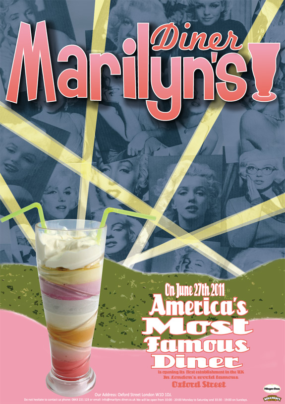
James Howard - Marilyn's Diner The theme for this assignment is the promotion a 1950’s style diner. The diner is to be based in the UK and will have a branch in each major city. For this assignment I hope to create a number of items such as; a logo, I will make this bright and colourful as it is one of the main assets, a menu which will feature the logo I also want to make sure that the items I put into it are similar to what was produced in the 1950’s, a flyer which will entice people into visiting the diner therefore it must be bright and must feature the logo and other necessary information, a business card which will have contact details and an address of the diner, a compliments slip which will be given with the bill to thank customers for visiting the diner and finally a t-shirt as a promotional item. The t-shirt will have either the logo or typography.
|
 |
| - - - - - - - - - - - - - - - - - - - - - - - - - - - - - - - - - - - - - - - - - - - - - - - - - - - - - - - - - - - - - - - - - - - - - - - - - - - - - - - - - - - - - - - - - - - - - - - - - - - - - - - - - - |
 |
Rhiannon Blyth - Little Tiger Industries Creating a range of graphic medias for the launch of ‘Little Tiger Industries’. The company is centred on the idea of creating new products out of original vinyl records; their range includes funky vinyl bowls, bookends, table mats and jewellery. The company is not yet trading on a big scale; however they are looking to launch themselves into the market with a strong image. Initially I will create the brand identity for the company, including the development of a logo to be used company wide, alongside promotional materials such as business cards and letterheads. The owner has also asked me to design potential packaging for the products, all to be made out of recycled vinyl sleeves. However, the main task I will undertake is designing a graphical poster campaign which can be adapted for online advertising. For design influences I wanted to use a iconic artist such as Jamie Reid, I then want to go for lowbrow artists as this is possible the style that I want to use. Artists such as Shepard Fairy, Robert Williams, Gary Panter, Camille Rose, John John Jessie and also Margaret Killgallen. For techniques I will be using a wide variety such as traditional hand drawn, to also computer design and also illustration, I will also be making spray paint temples and also using spray paint. |

|
 |
||


![]()