| Summer Show 2019 | |||||
 |
 |
 |
 |
 |
 |
| Textiles and Fashion Group |
 |
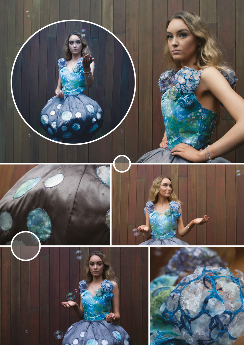
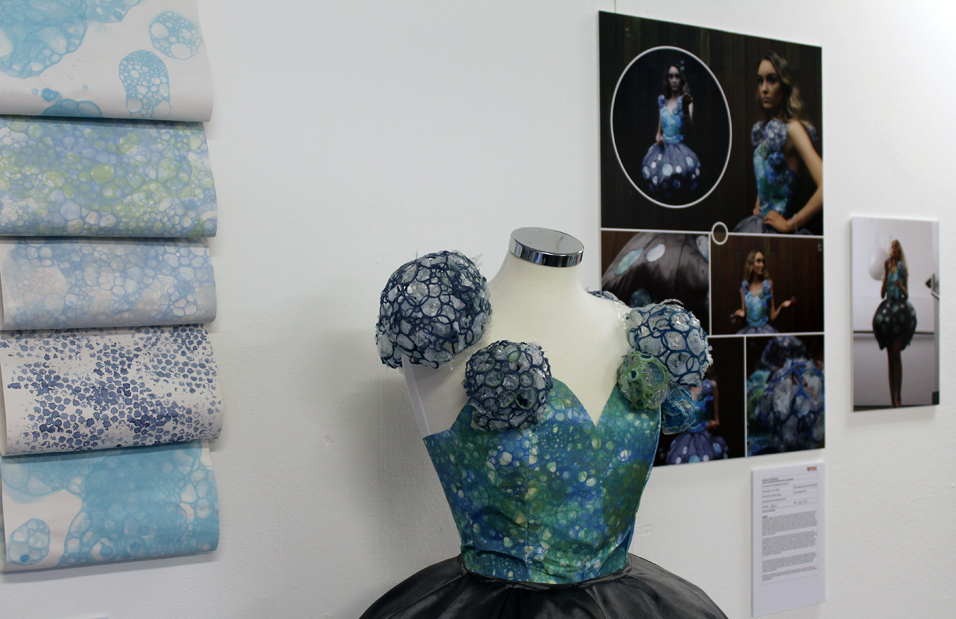
Lucy O'Reilly - Fragile I have decided to focus on the theme fragile, as there are many interpretations of how fragile can link with objects, or even feelings to a human. I have created my FMP with the emphasis on bubbles. I like the way that bubbles looks in the light as they are transparent but create colourful rainbows when they hit the light. Bubbles are very fragile as they pop as soon as they have been touched so they |
don't last very long which makes bubbles so delicate. Bubbles can create happy emotions as they pop and are mainly related to children playing. There can also be a more challenging element to the theme than simply children playing. I will create a garment that represents confidence and playful energy, whilst at the same time expreessing a vulnerability and fragility to the piece.
|
 |
||
 |
||
| - - - - - - - - - - - - - - - - - - - - - - - - - - - - - - - - - - - - - - - - - - - - - - - - - - - - - - - - - - - - - - - - - - - - - - - - - - - - - - - - - - - - - - - - - - - - - - - - - - - - - - - - - - |
 |
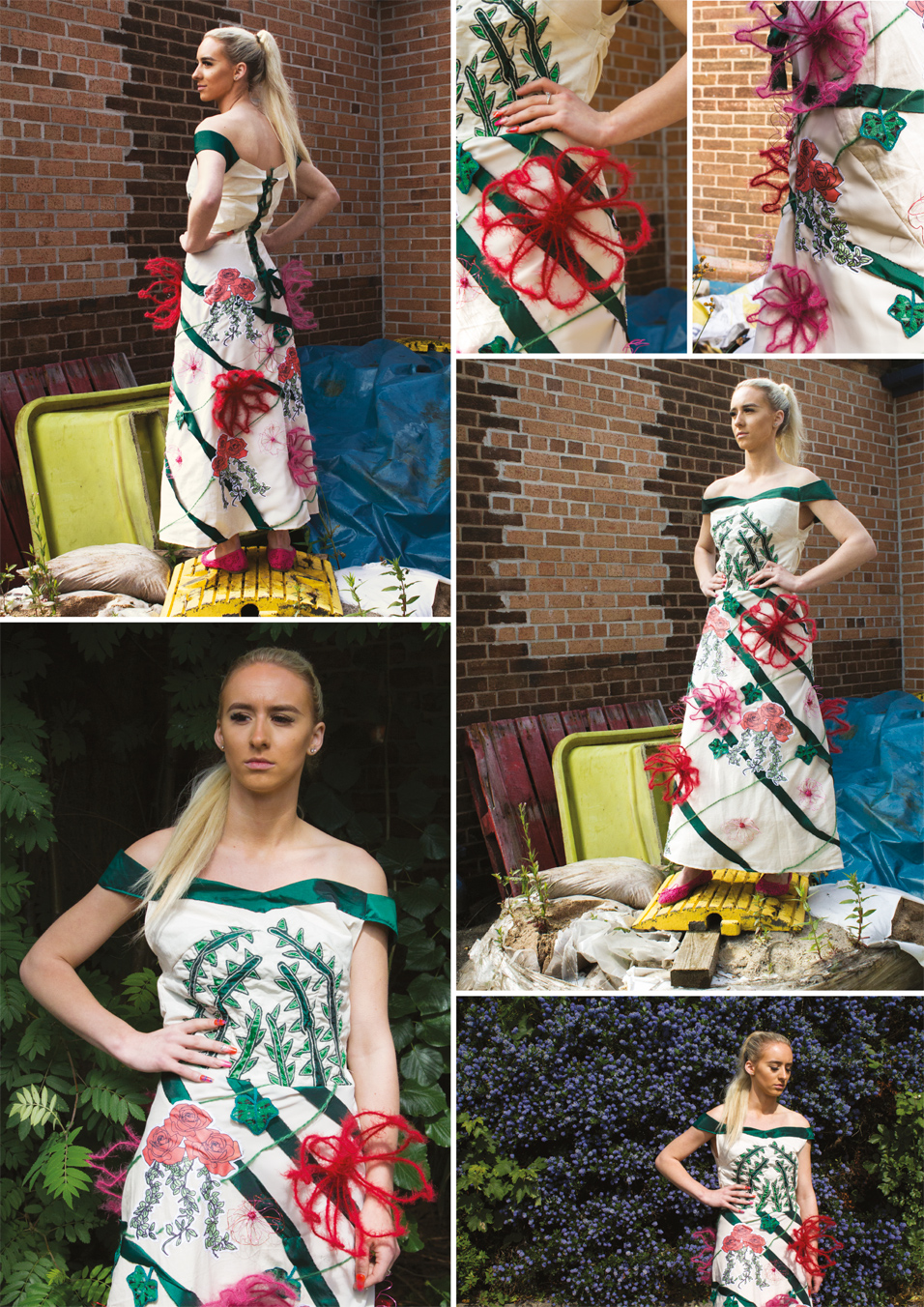
Chloe Leung - Connectivity/ Ivy Crossing The Border I will be working towards a couture/costume piece that shows vines and ivy taking over something to make it more beautiful. I will focus on ivy and vines because it is part of nature and I want to expand my view point and idea of nature in manmade structure. I started by looking at images of ivy and also looking at articles of flower bombing, as that is nature taking over manmade objects or less beautiful things. I also looked at couture pieces that could be inspired by a similar subject to mine. I explored ideas of photo bombing such as using digital effects and technology, for example, Teamlab who uses graffiti using digital images projected on a surface. |
|
 |
||
| - - - - - - - - - - - - - - - - - - - - - - - - - - - - - - - - - - - - - - - - - - - - - - - - - - - - - - - - - - - - - - - - - - - - - - - - - - - - - - - - - - - - - - - - - - - - - - - - - - - - - - - - - - |
 |
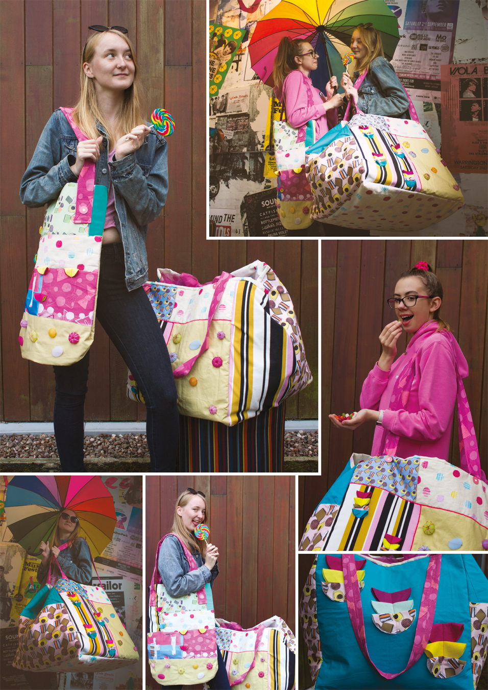
Rachel Roberts - Candy Crush My theme of my project is Candy Crush but more specifically sweets and sweet wrappers and how they can be used to create different patterns and different textures. I really liked how the sweets and sweet wrappers all have bright, vibrant colours that catch the eye and I will be using this as inspiration when working towards creating a collection of bags. I love how some designers can achieve a big impact in their creations by using intense colours. I also will be looking at the neon side of the colours looking at the candy crush mobile game and looking at the different colours they use. In the mobile game they use bright greens, reds, pinks, yellows and oranges. All of the colours stand out from each other. |
I will look at Manish Arora fall-winter 2014/15 collection, Moschino 2015 spring, Priscilla Jones and Kurt Schwitter. In the Manish Arora Fall- winter collection all the neon colours they use stand out and are very eye catching. I will also look at Moschino 2015 spring collection which also uses bright vibrant colours. As they have been inspired by brand packaging and Barbie, I will study Priscilla Jones's work. It isn't as vibrant as the other collections but she uses quite muted colours to produce some really delicate pieces of work linking to afternoon tea. Finally, Kurt Schwitter creates beautiful collages with different pieces of paper he has found when he went traveling. I may create some collages like his by using old sweet wrappers and new sweet wrappers showing the contrast between the two. When developing my work, I would like to explore using techniques such as patchwork, machine embroidery, sublimation print, dying fabric and slash and show. When generating these techniques I will be constructing a process table showing how I created each technique. By using these techniques it will drive me to create pieces that are similar to my inspired designers |
 |
||
| - - - - - - - - - - - - - - - - - - - - - - - - - - - - - - - - - - - - - - - - - - - - - - - - - - - - - - - - - - - - - - - - - - - - - - - - - - - - - - - - - - - - - - - - - - - - - - - - - - - - - - - - - - |
 |
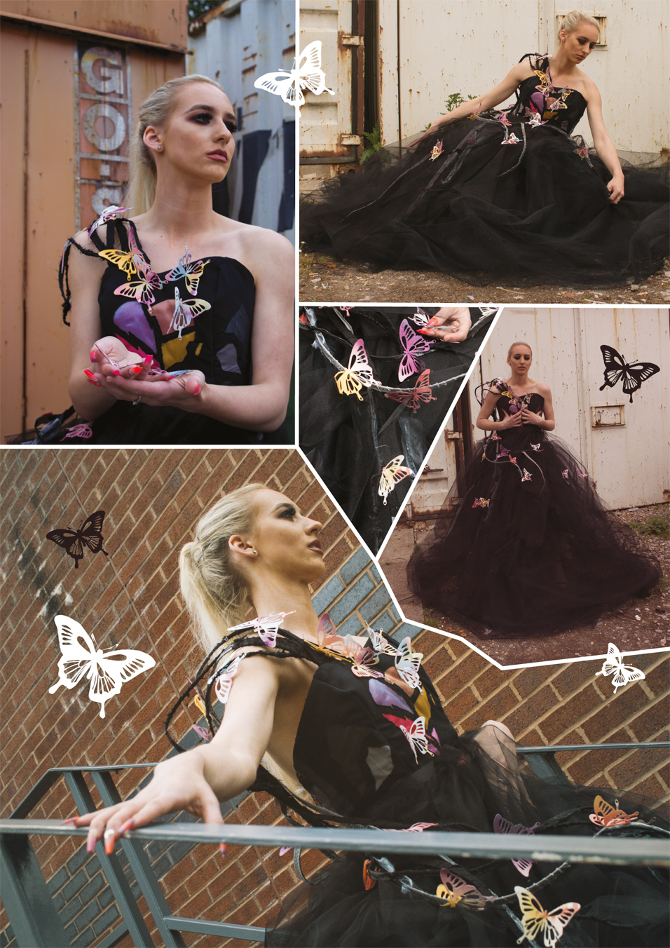
Karolina Strycharz - Fragile My brief is to put the theme of fragile into broken hearts and to sadness, to show you can overcome the dark place and be happy again, unhappiness is only a temporary thing. I will be working towards making a main couture piece to show my theme then a ready to wear piece to balance it out. My starting point will be researching different designers such as Alexander McQueen. I think his work has inspired me, for example the butterflies are coming from a dress as if they are trying to escape, think this could give me an idea of how to show that the butterflies are beauty emerging from the sadness to a happy times because butterflies have a positive connotation. Also Caroline |
Broadhead, I think her garments look very fragile, loose and in the sense of the way they are hung. Even though they are simple, they all have meanings which reflect from each garment. It is very inspirational. Maison Martin Margiela deconstruction I think this artist fits well with my theme because its deconstruction and reconstructing links with feelings because when you get your heart broken it's like deconstructing then when you get back on your feet it reconstructs and becomes something beautiful. Then finally I will research into Michael Brennand wood, his work doesn't immediately appeal to me however it will make a good starting point as a contrast to other works. Then I could also research into statistics of heartbreaks and relationships to understand the pain and healing process. The research will only take me a few days then development will be my main focus till I am ready to start my garment. I intend to create digital techniques using Photoshop and illustrator, to use different media and develop my understanding. I also am using photography to get primary images to show my understanding of the theme. I will produce textiles samples on the sewing machine. |
 |
||
| - - - - - - - - - - - - - - - - - - - - - - - - - - - - - - - - - - - - - - - - - - - - - - - - - - - - - - - - - - - - - - - - - - - - - - - - - - - - - - - - - - - - - - - - - - - - - - - - - - - - - - - - - - |
 |
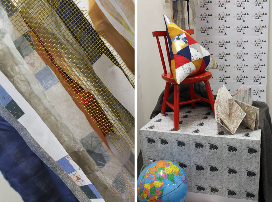
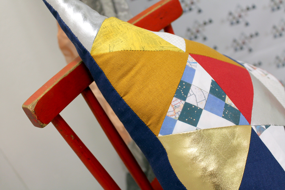
Emma Harper - Connectivity I chose to make interior pieces for my final major project because I had previously done it before and found that it appealed to me more than couture and garments did. Making interior items is just as complex as it is to make an item of clothing, sometimes more so depending on the item. |
Interior can mean anything from a neat little rug in the corner of a room to a chandelier made from anything you can think of. Working the concept of interior design into my work wasn’t difficult at all, I knew the basics of what I wanted to make and started from there. I ended up making a triangular cushion that features a patchwork triangular design and another patched up design |
 |
||
 |
||
| - - - - - - - - - - - - - - - - - - - - - - - - - - - - - - - - - - - - - - - - - - - - - - - - - - - - - - - - - - - - - - - - - - - - - - - - - - - - - - - - - - - - - - - - - - - - - - - - - - - - - - - - - - |
| Fine Art Group |
 |
Molly Mitchell - Inspiring Women In History This piece is inspired by Judy Chicago's Dinner party, in which a huge dinner table was created that's purpose was to celebrate women and their achievements. I represented this piece by choosing my woman to represent it, Marina Abramovic. She's a performance artist that has changed the way we view art, and where the boundaries now lay. She uses pain, fear and human endurance as subjects and delves deep into subjects we are too afraid to even speak of. The objects on the table represent a piece she did called rhythm 0 in which she stood for 6 hours and let gallery visitors do as they please to her with over 70 objects to use, some domestic, some deadly. I feel some of my audience will understand if they know who she is and how she is relevant, I would be mostly content if they liked my piece in general. One of my major influences had to be the piece Rhythm 0, where Marina stood for over six hours doing absolutely nothing, but allowed the gallery goers to do whatever they pleased to her. This included people undressing her, cutting her, sticking thorns in her |
stomach, drinking her blood and there is even an account of a man who attempted to shoot her with the loaded gun provided which was part of the piece. These things are referenced through the imagery on the main panels, the loaded gun appears in her portrait, as well as the thorns over her stomach area. I also made a reference to her Balkan war piece, in which the thousands bloody cow bones she attempted to wash is the background of the portrait, this was to also represent how she does NOT hold back from symbolising unpleasant subjects. I feel like my project was very successful, and I managed to complete my panels in a safe amount of time and to a standard I believe was acceptable. At first I was careful to paint the portrait in washes to make sure the paint did not crack or damage when the fabric is being manoeuvred, but I then discovered that the fabric was not as weak as I thought and used more paint to my liking. This made my piece stand out and look much bolder, which was important for the subject matter itself. I painted these objects from observation to achieve as much likeness as possible, and I feel like I have successfully implemented this. I feel that research has been sufficient, although sometimes I wish I could show my flow of development in a smoother fashion, rather than being unclear about some ideas in the stages of generating ideas and refinement of my pieces. |
 |
||
| - - - - - - - - - - - - - - - - - - - - - - - - - - - - - - - - - - - - - - - - - - - - - - - - - - - - - - - - - - - - - - - - - - - - - - - - - - - - - - - - - - - - - - - - - - - - - - - - - - - - - - - - - - |
 |
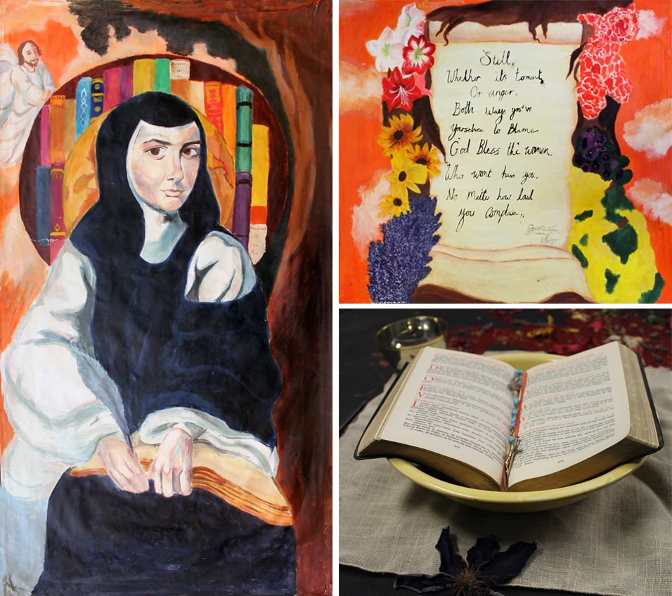
Jessica Massey - Inspiring Women In History The theme was inspiring women in history, we presented this work by making a table that consisted of my portrait of Sor Juana, another piece that was connected to her and her life's work, and table that consisted of a dinner setting with a twist to it so that also represented Sor Juana, and her work. the reason I choose her for the dinner party is because she fought with words, she was different from most of the women that had been chosen, she was women of faith who could see the flaws within that faith and spoke about it and I think that's such much stronger than fighting a war. Her words spoke the truth that women were to frighten or didn't know how to vocalize their thoughts, she gave women a voice and an opinion. I think people would understand my work and because of the connections between the pieces, such as the literature reference and the references to her religion and what she wrote about and how her work influences people now. My influences were Artemisia Gentileschi I referenced her style of work within my portrait piece. I also used reference photos from our Liverpool trip and from online and I've stored them within my book. I've also used influence within the colours of my work and how they complement each other and look like realist colours that you would see, such as browns, light oranges, and dark blues. I also referenced it with the shading and lighting quality of the clothing and face which was what Artemisia was well known for within her work. |
I interpreted Sor Juana's love for writing and speaking her mind not matter how, I should this by referencing a quote from a poem she wrote to the church. I was also influenced by religious art work and it shows within my main piece, and reference piece, because of the halo that is around her head, paintings of saints normally have a halo surrounding there to represent their faith and I wanted to interoperate that with a twist by turning it into a book case and globe. I did stick to my schedule for my first one and it was successful but for my second piece I did stick to the schedule but I wished I had more time to define and work into the flowers because they don't look as defined as I was hoping to do, I did my table on time within the time schedule and I came out very successful and they all worked together very well. And I made sure to improve areas and take not of the things people suggested to change. |
 |
||
| - - - - - - - - - - - - - - - - - - - - - - - - - - - - - - - - - - - - - - - - - - - - - - - - - - - - - - - - - - - - - - - - - - - - - - - - - - - - - - - - - - - - - - - - - - - - - - - - - - - - - - - - - - |
 |
Charlie Cooper - Inspiring Women In History In my response to the dinner party by Judy Chicago I picked three amazing women, Kathrine Johnson, Lady Gaga and Grace Jones. I narrowed it down to Grace Jones. I choose Grace because she isn't like other women I've seen before. She is a symbol of fierceness in the face of misogynoir. She encourages gender fluidity and body positivity, she is a question mark followed by an exclamation point. I knew I wanted my theme to fit well with her personality so I picked disco because she is the queen of gay disco! I created two paintings, one of Grace herself and one of neon shapes inspired by 80's disco. I feel like the audience will understand my work because if anyone knows who Grace is, they will understand her personality and behaviour and this is evident in my work. The women my peers chose were more prestigious and clean cut whereas I wanted someone who was an outrageous rule breaker who did what she wanted, she didn't conform to society's rules because she just wanted to be herself and she ended up becoming an androgynous icon without even trying to be. Our Dinner party was influenced by Judy Chicago as she created an installation piece called the dinner party that represented 39 historically famous women. When designing my table layout I took inspiration from studio 54 which was grace's favourite disco club. I also took inspiration from Rosalyn Drexler when it came to painting my portrait of Grace. |
I love her use of strong, bold colours and also the way she leaves the faces black and white, you can see this in my work where I left Graces face black and white whilst everything else around her was painted with intense colour. When painting my second piece I was inspired by Natalie du Pasquier's pattern work from her Memphis group where she used a variety of wacky colourful shapes. You can see this in the shapes I have used. She favours a low tech approach to her work therefore when composing my painting I chose not to use Photoshop for this one to maintain her style. I wanted to achieve flat colour just like Rosalyn Drexler so I chose to paint with acrylic paint because you get the flattest, most pigmented colour possible. I chose to use graphite for Grace's face because I wanted it to be the only thing that had tone on, because Drexler chooses to leave the faces in black and white and uses strong bright colours in the background which creates a nice contrast. I choose to use neon powder paints because neon colours fit in with my 80's theme and these paints created nice bright neon colours. I found it difficult to find a female artist that used strong neon colours in the 80's because there weren't many, they were mostly male. I decided to use neon powder paints because they were very bright and fit well with the 80's theme but after a while of using them I realised it was very hard to achieve the flat colour I wanted, they came out very bumpy due to me adding more and more layers. I also struggled to articulate my ideas which made it very hard to describe what I wanted to create. |
 |
||
| - - - - - - - - - - - - - - - - - - - - - - - - - - - - - - - - - - - - - - - - - - - - - - - - - - - - - - - - - - - - - - - - - - - - - - - - - - - - - - - - - - - - - - - - - - - - - - - - - - - - - - - - - - |
|
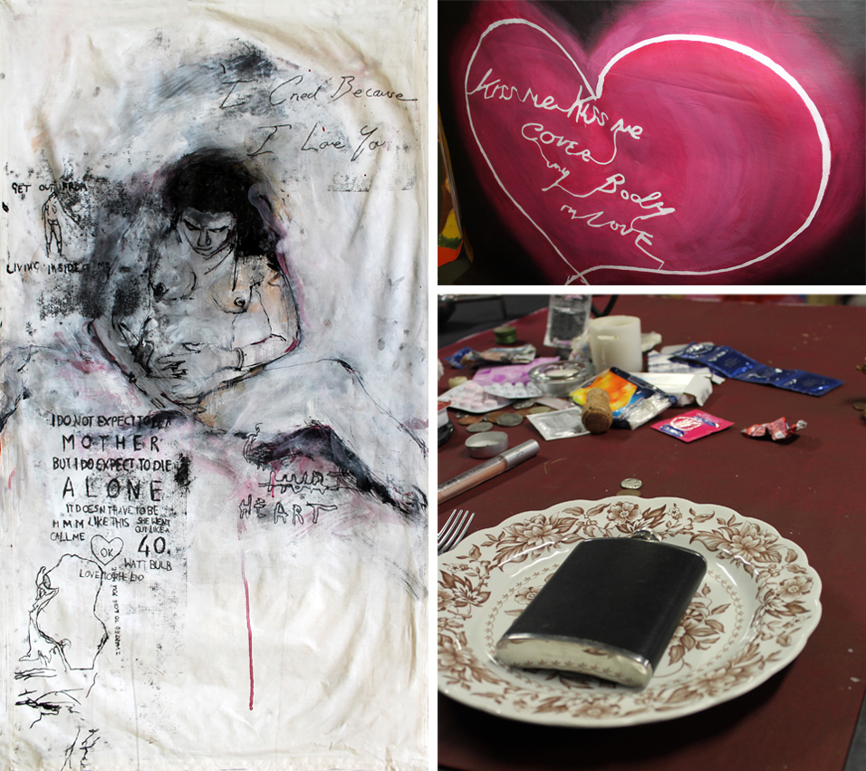
Briannan Russell - Inspiring Women In History We were given a project based on Judy Chicago's dinner party, a well know piece of work. That celebrates powerful women. In this project we would be choosing our own powerful women, from any background and for our own reasons. From four women we researched we had to choose one. I chose Tracey Emin, in this project we each created individual pastiches/homages. I took a different approach to this task, and I decided that not only would I do Tracey Emin. But I would do it in her own style of work. I wanted to represent Tracey Emin in a way that I could convey to people that her Image is empowering. She shows women that your body is your own, promiscuous and outrageous. She's just a badass. Once I started developing Ideas for my pastiche/homage, I found many influences in her work. Her figurative drawing was the influence to do Tracey Emin, long before I had chosen my powerful women. Her work almost seems so effortless but so undisciplined. Her neon work creates so much power, from her life and experiences she cries to you through words. The sources are referenced throughout my work, and in my development. Practicing with different styles of her work helped my understanding of her confessional work. |
While developing ideas for my pastiche I broadened the range of media I was using, from sketches to ink drawings. I practiced her figurative drawing until I was comfortable on canvas, after the ink drawings I moved onto the mono prints. Which I used for the finishing touches of the pastiche. The figurative drawing was done with acrylic washes and black ink. I mainly used acrylic paint for my homage, but the techniques were more difficult. I repeatedly blended the paints until they would gradually grade together. The success of my project is all down to my development, and good quality control. For my pastiche, I had to know when I was working into the painting too much. It has a soft touch and a light wash, but over drawing something can easily ruin something great. While working with my homage neon work, I wanted my work to be blended with no flaws. It became more difficult to do the more layers I layered up. If the paint was dry it wouldn't blend, so it needed to be done at a fast pace. Something that I still can't quite do. For the table tops, I knew that I would do Tracey Emin's "my bed". So in order for this to work, I had to carefully look through the images, to find each individual object. This came with ease, as it was not too difficult to find most of them. With my evaluation, evaluating it was very much like linking everything back to the artist, which I was able to do with confidence. Seeking guidance when it was necessary helped me finish for my deadline. This project was a success for me, I was able to develop my skills in the style of Tracey Emin. And in doing so my skills as an artist, I found everything I was looking for. And I am happy with the end results of both my pastiche and homage. |
 |
||
| - - - - - - - - - - - - - - - - - - - - - - - - - - - - - - - - - - - - - - - - - - - - - - - - - - - - - - - - - - - - - - - - - - - - - - - - - - - - - - - - - - - - - - - - - - - - - - - - - - - - - - - - - - |
 |
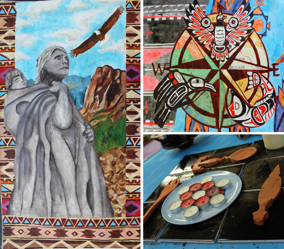
Millicent Patten - Inspiring Women In History I have created a table setting for a Native American woman called Sacagawea. I used Native American patterns and symbols to show the tribes that she was from. I painted scenery from the place she lived and from a time period that isn't too different from hers. I used colours that are symbolic of her tribes like turquoise, blues, red, greens and different washes of black. I painted animals that are scarred to Native Americans like a salmon, crow and bald eagle. These animals represent the traits that Sacagawea had like courage and loyalty. They also represent the tribes that she was a part of. I used a compass, maps and water to represent my theme which is Sacagawea's journey. Furthermore, I used black tiles with soil on top of them as a placemat to show how America went from a lush, green forests and plenty of animals to a country that is very man-made. I was influenced by Native American culture and by empowering women. I was also influenced by artists Judy Chicago and her piece titled 'The dinner party', I was also influenced by artists Elizabeth Shippen Green and by artist Helen Hardin. Helen Harding has a bigger influence as she is a Native American artist and her style of painting is the best way for me to show Sacagawea's life. The way she creates animals is what I did for the big piece with the eagle, fish and crow. It is simplistic but effective. Elizabeth Shippen Green's use of colours and style of painting influenced the portrait that I created of Sacagawea. |
I did manage to stick to my work schedule though I did fall behind a little bit when I was creating the portrait. I also personally think my project was successful. You can clearly see the Native American theme as well as the reason that Sacagawea is so well-known. My use of maps and a compass shows that Sacagawea was an explorer and the Native American symbols shows her culture. You can also see the artists that inspired me in my work. For example, I used a similar style to Helen Hardin to create the animals. The way I assessed my work is actually by asking others of their opinion. Throughout my project I would show people around me and at my job to see if they could figure out the theme and all of the hidden meanings in my piece. Lots of people picked up on the theme easily and some even managed to understand my hidden meanings, like the soil on the tiles to represent the change from a natural countryside to a built up country. One person even picked up on the water damage maps to represent a journey and the damage that America had undergone. |
 |
||
| - - - - - - - - - - - - - - - - - - - - - - - - - - - - - - - - - - - - - - - - - - - - - - - - - - - - - - - - - - - - - - - - - - - - - - - - - - - - - - - - - - - - - - - - - - - - - - - - - - - - - - - - - - |
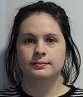 |
Emily Spencer - Inspiring Women In History For this project I made my own version and response to Judy Chicago's dinner table, following the theme of powerful women. My idea of a powerful women is someone who had achieved something great whether that be by standing up for what they believe in, excelling in their career or someone who had gone against all olds to achieve something. I represented my theme by showing my women (Wangari Maathai) in a positive light as well as having links to her achievements throughout my work. I made 2 panel pieces and designed a table top in response to the theme and concept. My first panel includes a portrait of Wangari Maathai, she is placed in the middle and takes up most of the panel as she is the main point and I wanted people to notice her first. The first panel also includes traditional Kenyan patterns and flag. For the second panel I took 4 key achievements from her life and represented them in 4 shaped abstract patterns. I think the audience will understand parts of my work which is what I wanted as I hope people will be intrigued by Maathai and go and looked into the work she's done. For my first panel I looked at 2 different artists. To begin I only looked at black artist which empowered other women of colour through their work. I did this because I wanted to link with the theme of powerful women as well as the fact Maathai was a proud African woman. The first artist I chose was Amy Sherald, who focuses on portraits. I liked her style of painting which is why I used it for the inspiration for my portrait of Maathai. I tried to recreate the simple tones and the smoothness of Amy Sherald work within mine. |
The second artist I looked at for my first panel was Mickalen Thomas, who uses a wide range of materials and techniques to make her pieces. However I only focused on her collages pieces which were the inspiration for the background of my panel. She gave me the idea to layer images onto of one another and to just bright pattern which stood out and clashed. The third artist I looked at heavily influenced by second panel who was Hilma Af Klint. Her work inspired me to make my own pattern which very geometric and shape orientated as many of her works followed the same abstract design. For this project I made sure to stick to my timetable and try my hardest to finish in time as I had time issues with my last project. I was successful with finishing my painting in time and without rushing. For my both my panels I used acrylic paint as I am most confident with it as well as the fact I enjoy using it. Acrylic paint is also easily assessable and available in large quantities which I needed. The process for both piece started with designing them on Photoshop as it allowed me to see the composition of the pieces as well as knowing how the final design will look. I then used a projector to trace each design onto the canvas, making it a quicker and easier process. For my first panel I used washes of paint to slowly build up the layers as although I wanted it to look smooth and simple I still wanted the depth of toned in it. However for my second panel I used thicker layers of paint as it was a much simpler design as it was mostly made up of block patterns. I think overall my project was a success as I think I conveyed my message and ideas to the audience as well as creating panels that show my technical abilities. I also think this project allowed me show my designs and planning skills as the whole thing links together successful and does a good job of showing the original theme and concept. |
 |
||
| - - - - - - - - - - - - - - - - - - - - - - - - - - - - - - - - - - - - - - - - - - - - - - - - - - - - - - - - - - - - - - - - - - - - - - - - - - - - - - - - - - - - - - - - - - - - - - - - - - - - - - - - - - |
|
Hannah Purcell - Inspiring Women In History Inspired by Judy Chicago's 'The Dinner Party', I created a place setting dedicated to the strong and courageous, woman, poet and photographer Anne Brigman who captured women posing nude with nature from 1901. I presented this theme through overt references to nature, femininity and pagan antiquity, as these are all things that Brigman identified with throughout her life. Through imagery, symbolism and medium, I represented these themes both literally and figuratively. During this project, I was highly influenced by Brigman's own photography and poetry and took inspiration from mother-nature herself as well as female artist, Francis Macdonald's 'Child in a Rose Bowl' which I saw at the Victoria Gallery in Liverpool. Throughout the project, I had researched different techniques and processes as well as symbolism relating to paganism and the natural world. I have also explored thoroughly the lives of several powerful women, their influences and the impact they have made. |
I allowed myself lots of time to explore and test different ideas which included: acrylic pouring, light grams, wood work, mono printing, making pigments from plant material, weaving, batiking and printing with plants. I created my first piece using graphite, water and white paint and really liked the tones and textures that this created. I used expressive lines and painted the background with a lavender toned wash which successfully captured the earthy and delicate style that can be seen in McDonald's work whilst reflecting Brigman's similar sense of femininity and strength. I really enjoyed the process of using the wax and raspberries to stain by second piece and feel like by doing this I had effectively combined an element of nature into my work. Towards the end of the project, I created myself a checklist to ensure I had included all the correct documentation for the techniques and processes that I had used. This massively helped with my ability to organise and time keep. Overall, I feel I have been successful in capturing the essence of Anne Brigman through my project and have insightfully selected medium, objects and imagery that communicated my theme well. Anne Brigman is a highly influential woman and i wanted to capture both her softness and strength to celebrate women's liberation and Brigman's courage to achieve in what was a heavily judgemental and male dominated field. |
 |
||
| - - - - - - - - - - - - - - - - - - - - - - - - - - - - - - - - - - - - - - - - - - - - - - - - - - - - - - - - - - - - - - - - - - - - - - - - - - - - - - - - - - - - - - - - - - - - - - - - - - - - - - - - - - |
 |
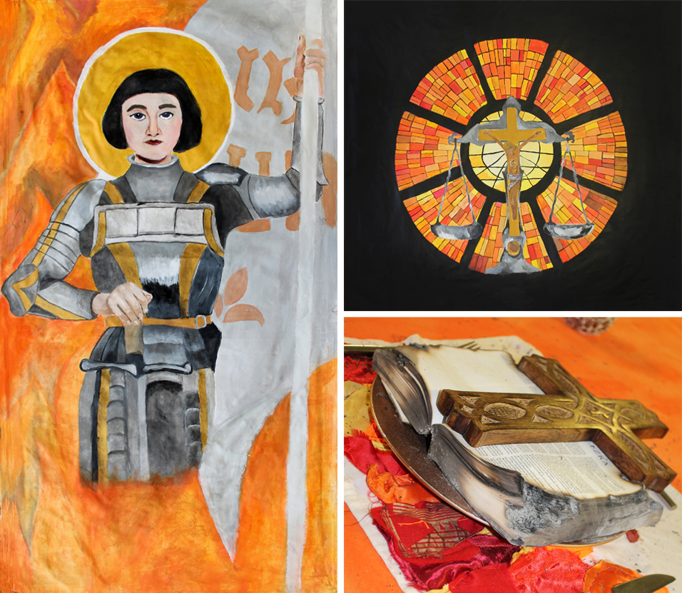
Nikita Stamp - Inspiring Women In History The theme behind my piece was that religion is equal to justice. I represented that by including the scales of justice and the cross with Jesus on it. I also showed Joan of Arc surrounded by fire to represent what killed her. Also, with the stained glass window I wanted to show the glass from a church with the orange and yellow windows to again show the fire. I believe my audience will understand my work and what meaning I am getting across. I made sure to make the background of my stained glass piece is pitch black so that the orange and yellow stand out and be eye catching and make it look like the orange and yellow is trapping the scales and Jesus. I think that the audience will like how the colours complement the overall picture and don't drown anything out. My influences were powerful women who physically made a stand and made sure their voice was heard, and I think that Joan of Arc was one of those people women. I was also influenced how religion is the one factor that can start wars and how it doesn't matter who you are but if you disobey a book you can be punished by death. |
I also wanted to show that women can be strong and have roles that were usually given to men. I wanted to challenge the idea that religion shouldn't have a say on who dies or who lives. I used a range of techniques, processes. I layered my paint on to build up tone and texture, I was careful not to add too much paint as it could make my canvas shrink or wrinkle. Also, when it comes to the work schedule I didn't stick to it as firmly as I should have. However, that being said I firmly believe that the project was a success. Also I think that I've come really far in this project and it's helped my future (university) and my skills as an artist. I assessed the success of my work by how other people understood what I was painting and if they got the meaning behind it. A few issues I faced was that I didn't stick to the schedule as strictly as I had hoped and I sometime got distracted and went on to do something else while not finishing my painting. However, in the end it all got finished to the desired outcome. When I making my piece I was influenced by the artist and Saint Catherine of Bologna as she was one of the saints Joan of Arc saw in her visions and also one of the only female artists in that time period. The painting was called 'Madonna Del Pomo' which showed the Virgin Mary and her baby with a halo around their head, so this inspired me to include it in my portrait. However I wanted to put my own spin on it so I used a lighter range of colours and gave it a more illustrated look. |
 |
||
| - - - - - - - - - - - - - - - - - - - - - - - - - - - - - - - - - - - - - - - - - - - - - - - - - - - - - - - - - - - - - - - - - - - - - - - - - - - - - - - - - - - - - - - - - - - - - - - - - - - - - - - - - - |
 |
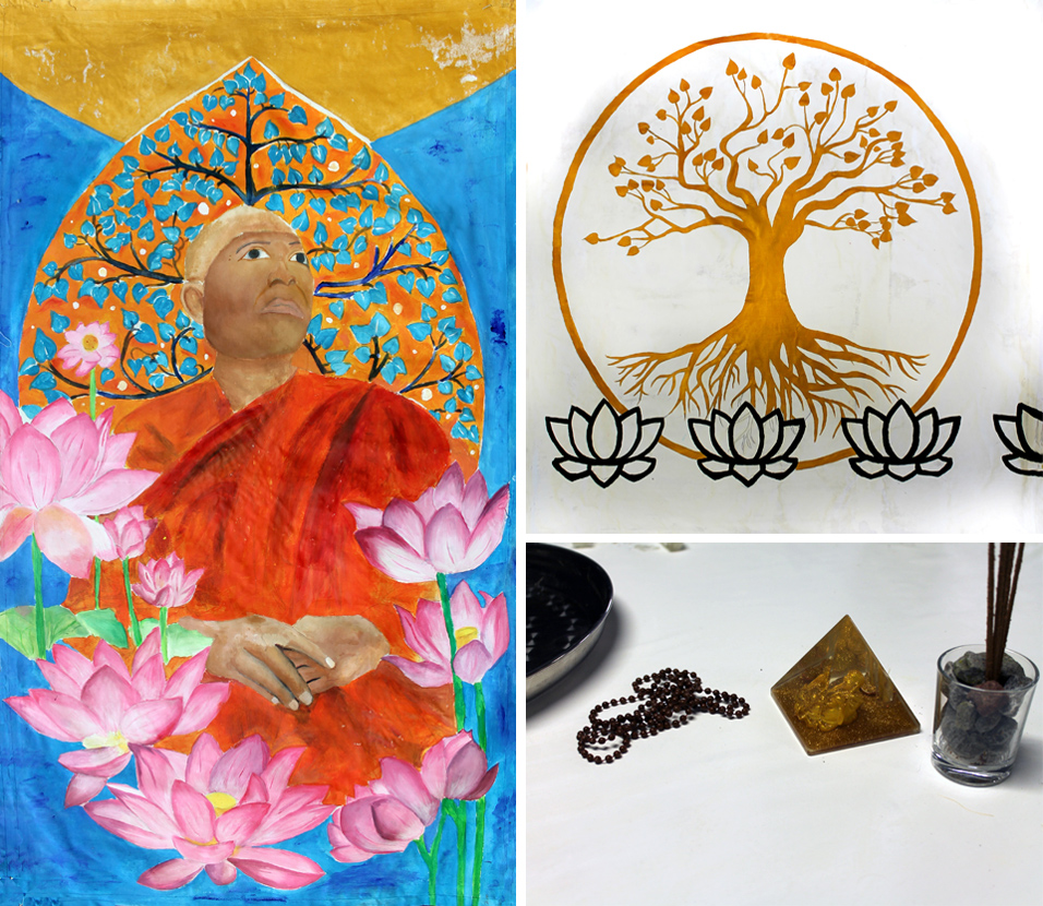
Yanin Hai-Ngam - Inspiring Women In History Dhammananda Bhikkuni ธัมมนันทา Born Chatsumarn Kabilsingh 6th October 1944, Thailand Religion: Buddhism Dhammananda was ordained in 2001 as Thailand's first female Buddhist Monk. She and her flock of 15 female monks were shunned by the state-backed Buddhist hierarchy. |
This powerful all-male order, known as the 'sangha', regard them as imposters forbidding any women from becoming monks. Thailand's official Buddhist order 'feels women are a big threat, especially women in robes'. Before Dhammananda there were no female monks at all. She circumvented the sexist Thai system, becoming ordained as a monk in Sri Lanka, returning as Thailand's first female monk in modern times. |
 |
||
| - - - - - - - - - - - - - - - - - - - - - - - - - - - - - - - - - - - - - - - - - - - - - - - - - - - - - - - - - - - - - - - - - - - - - - - - - - - - - - - - - - - - - - - - - - - - - - - - - - - - - - - - - - |
 |
 |
| Photography |
 |
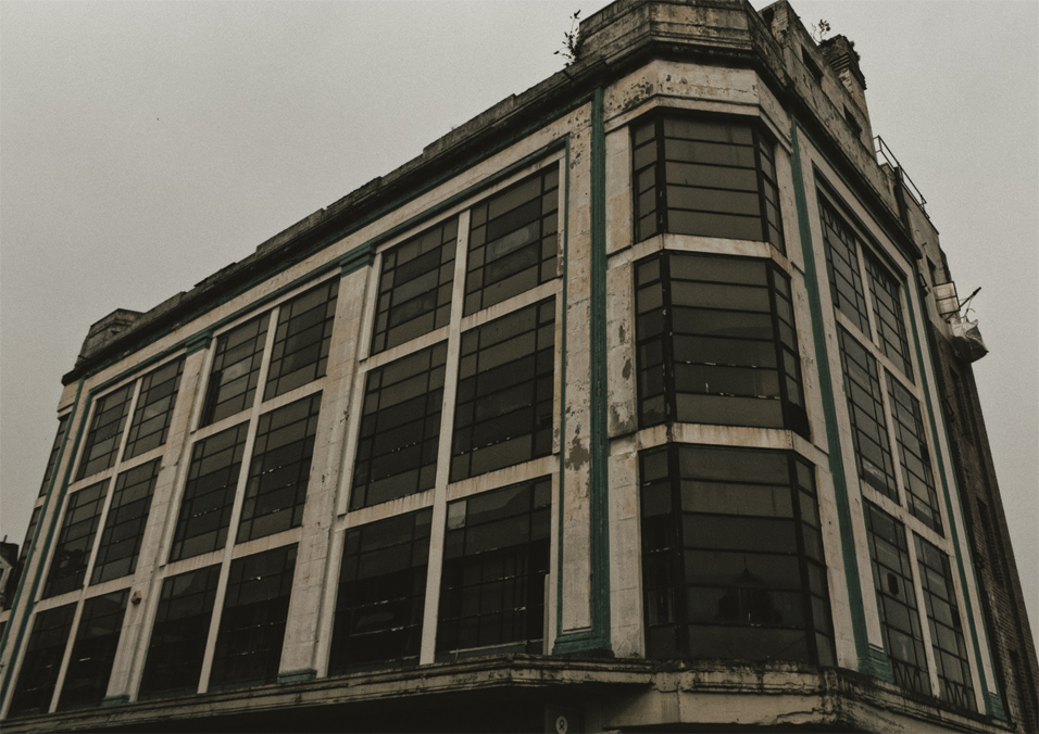
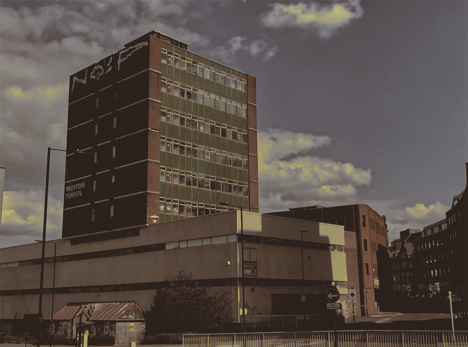
Lucia Cassella - Urban Decay For my final project, I thought to look at Urban Decay but in more detail and thoughts of buildings and what they used to be used for. I was mostly focusing on different architectural styles in different cities, industrial (20th Century) buildings at Manchester, Liverpool & Sheffield, textures, architectural details & weathering, shop/business signs from different time periods and just looking for interesting buildings/warehouses/factories from old industries. |
For inspiration, I have used three photographers that have taken similar pictures of buildings that I want to take pictures of. I have picked John Bulmer, Peter Mitchell & Al Baker. I have mostly used John Bulmer’s work because he has mostly took pictures of old shops fronts and old factories as well. But I picked the other two photographers, Peter Mitchell & Al Baker, because I wanted to capture some gloominess when I’m taking my pictures, like they have with their work I have picked out to look at. But for looking at gloominess, I mostly focused on Al Baker’s Hulme project. |
 |
||
 |
||
 |
||
 |
||
 |
||
 |
||
| - - - - - - - - - - - - - - - - - - - - - - - - - - - - - - - - - - - - - - - - - - - - - - - - - - - - - - - - - - - - - - - - - - - - - - - - - - - - - - - - - - - - - - - - - - - - - - - - - - - - - - - - - - |
 |
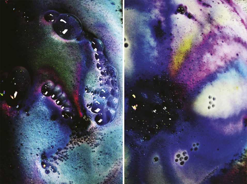
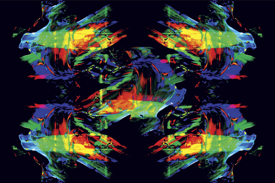
Georgina Constantinou - Colour For my project the theme I had chosen to do Colour Photography. Despite doing this the previous year I decided to do it again but putting my focus onto different objects. Last year I experimented with light and colour but this year I have decided to experiment with liquid and colour because I have never done that before so I decided to try something new but within the same theme. For the duration of the project I was experimenting with a wide range of objects such as Paint, Bath Bombs and Oil. From artist research I managed to find a wide range of artists to influence me for the duration of my project. An example of this would be an artist that I found named Linden Gledhill. From researching the work he does on his website I found that some of the work that I found gave me the inspiration for the images that I later produced in the project. From researching another artist named Mark Mawson and David Lund that gave me the idea to experiment with exploding paint and capturing it as it is exploding. |
From my artist research I then went on to prepare the shoots that I intended to do for the duration of the FMP. For my first shoot which was experimenting with Oil Photography I had to make sure I had the right equipment to use to be able to do this. For this shoot I was required to use a macro extension lens. When using this it makes me able to zoom in fully so that way I was able to see the oil bubbles more clearly. Also to give them colour I used colourful tissue paper and placed it underneath and light box with the oil on top so that way I could add colour to the images. For the second shoot I did I was experimenting with bath bombs. In order to capture this the right way I had to capture the images using sport mode on my camera so I was able to capture each second of the bath bomb dissolving into the water. For the last two photo shoots that I did they were all with paint. For the first shoot I did I was able to capture the paint as it was falling to the ground which was the idea that I wanted to do. I also used sport mode for the two shoots that I did so I was able to capture every second of the paint falling to the ground.
|
 |
||
 |
||
 |
||
| - - - - - - - - - - - - - - - - - - - - - - - - - - - - - - - - - - - - - - - - - - - - - - - - - - - - - - - - - - - - - - - - - - - - - - - - - - - - - - - - - - - - - - - - - - - - - - - - - - - - - - - - - - |
 |
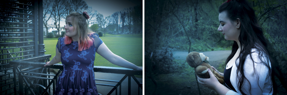
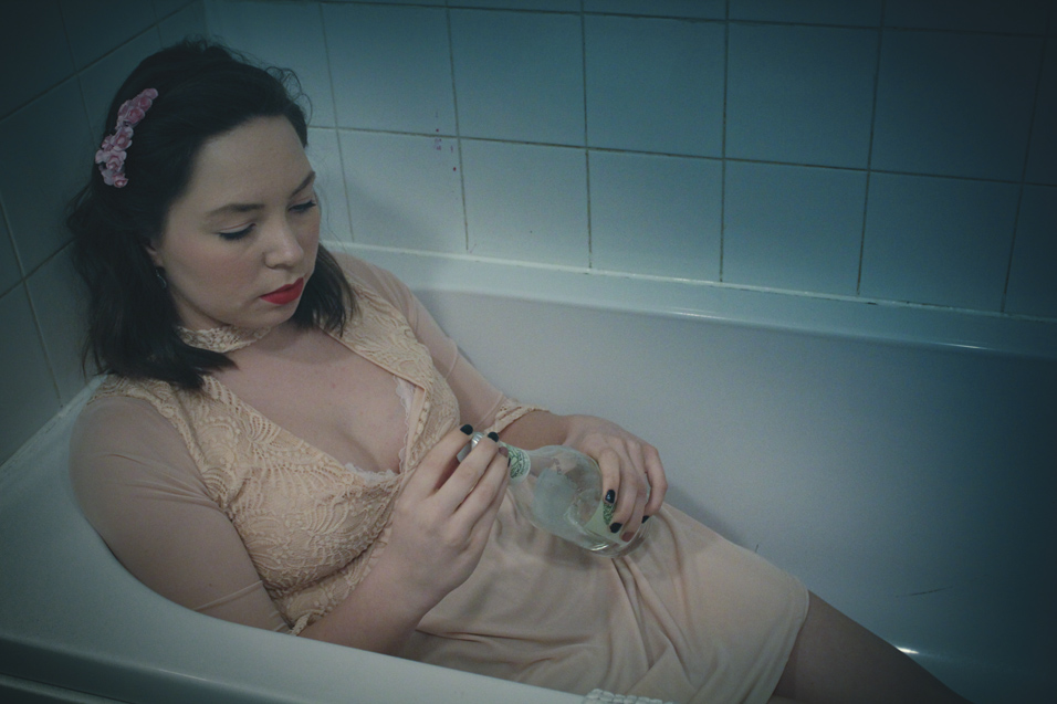
Eleanor Davidson - 21ST Century Fairytales For my FMP, I have chosen to base my theme around classic Fairytales and implement my own modern twist into my work. My aim is to take four popular childhood stories and recreate them with deeper, darker concepts of issues faced in today's modern society ranging from bullying and mental health disorders, to the dangers of social media and the population's beauty standards. The Fairytales I intend to recreate include: Little Red Riding Hood, Sleeping Beauty, Snow White, and Cinderella. Before starting my project, I am going to carry out contextual research to find artists who have experimented with their own fairytale-themed projects. I came across an artist named Laura Zalenga who uses symbolism and objects to represent stories. |
Another photographer called Anita Anti creates fantastic portraiture with costumes of characters from different fairytales and fables. I also did some film research of "The Company of Wolves"- a 1984 fantasy horror film based around the story of Little Red Riding Hood. I will use a variety of sources to complete my contextual artist research to support my FMP theme. My research will mainly originate from each individual photographer's personal profiles and online portfolios, along with digital magazine articles/interviews. I aim to produce a series of images for each of my chosen Fairytale stories using locations and props to create my own traditional, yet modern representation. I want to use editing softwares including Adobe Lightroom to experiment with a variety of editing techniques and give my images a cinematic atmosphere which will represent my themes well. I am also going to use Adobe Photoshop to test out blending and layering images with different textures. |
 |
||
 |
||
 |
||
| - - - - - - - - - - - - - - - - - - - - - - - - - - - - - - - - - - - - - - - - - - - - - - - - - - - - - - - - - - - - - - - - - - - - - - - - - - - - - - - - - - - - - - - - - - - - - - - - - - - - - - - - - - |
 |
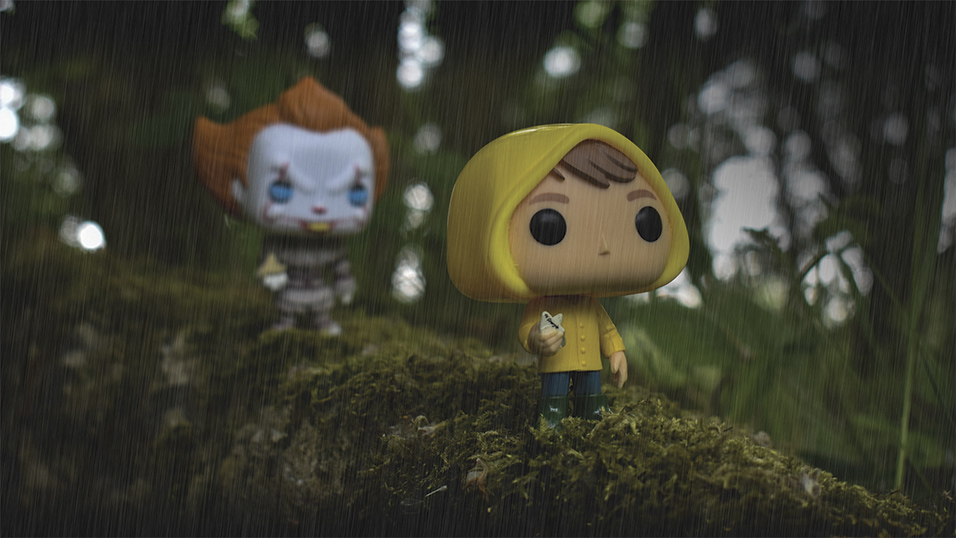
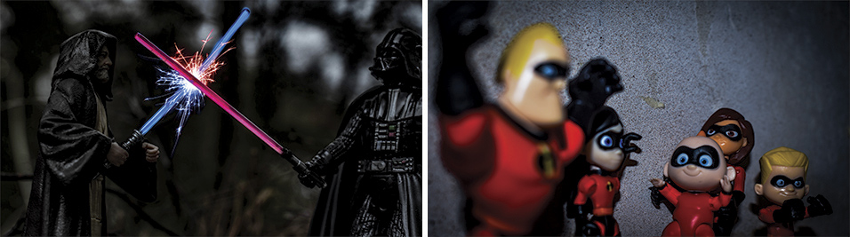
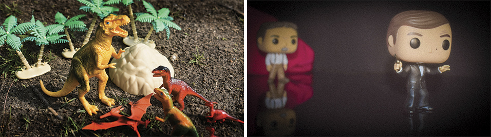
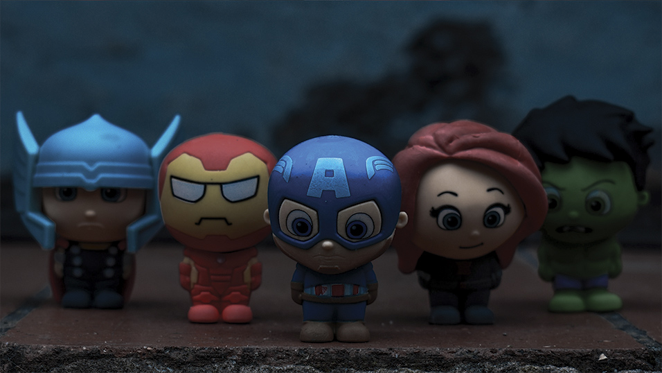
Jordan Vaughan - Toys in Action I wanted to do this as I found a artist named Michel Wu, he take photos of toys but he does action shots with them. On his website he had videos of behind the scenes and shows that he uses metal wires to prop the toys into place. I'm planning on doing at least 10 movies with very iconic scenes and I'm doing this to help with advertisement for my unit 16 as if I |
didn't do iconic scenes it would draw people in and if I have 10 iconic movie scenes the people viewing my photos are bond to know at least 1 of them. I am going to do most the shoots not in college as I want to find the perfect backdrop for my scenes ,meaning looking round while I'm doing my plans but for the Spiderman shoot I will have to use the college green screen and put a photo of buildings behind it. |
 |
||
 |
||
 |
||
 |
||
 |
||
| - - - - - - - - - - - - - - - - - - - - - - - - - - - - - - - - - - - - - - - - - - - - - - - - - - - - - - - - - - - - - - - - - - - - - - - - - - - - - - - - - - - - - - - - - - - - - - - - - - - - - - - - - - |
 |
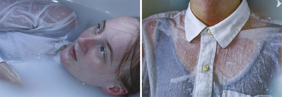
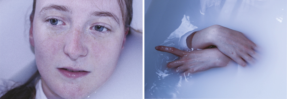
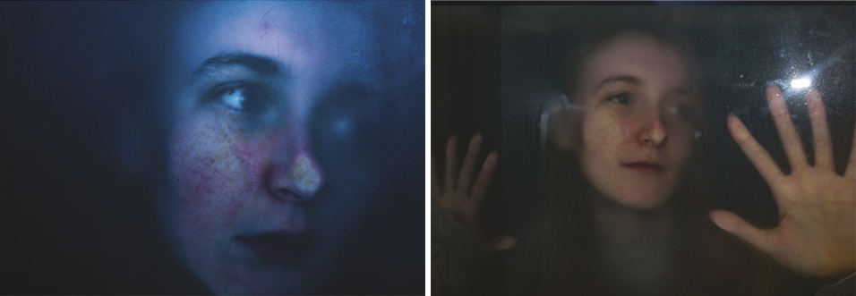
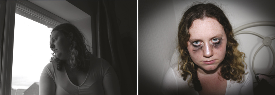
Dale Lowndes-Smith - Disassociation For this project I've decided to explore the word disassociation this word is linked to many mental illnesses and certain feeling i feel like i can relate to a lot of these things an i would like to explore these through the images i will shoot and edit. With this in mind most of my shoots will be very cohesive and work together to represent this. |
For this project I will be focusing on the word disassociation and the meaning around it Depression |
 |
||
 |
||
 |
||
 |
||
| - - - - - - - - - - - - - - - - - - - - - - - - - - - - - - - - - - - - - - - - - - - - - - - - - - - - - - - - - - - - - - - - - - - - - - - - - - - - - - - - - - - - - - - - - - - - - - - - - - - - - - - - - - |
 |
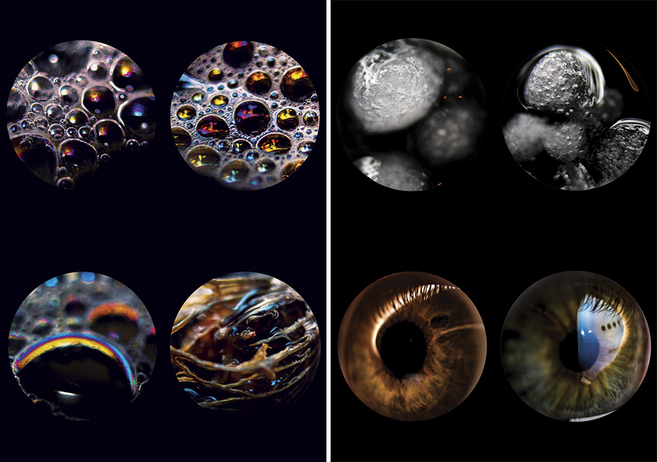
Yasmin Magan - Worlds Within Worlds Whilst researching into possible ideas for the theme of "worlds within worlds", I have decided that I want to use macro photography in my project because I am confident with this style of photography and I like how it looks. My first idea for a macro photography shoot is to capture photos of peoples eyes with different lights reflecting into them to make the different colours within the iris stand out. I came up with this idea because when lights reflect from some peoples eyes, different shapes and colours within their iris' stand out and this gives me connotations of space. Also, peoples eyes are very personal and they can offer an insight to their whole life and they can act as a metaphor for their own world. |
I like the idea of having circle shapes as a theme that runs through my project because I want to capture photos of eyes, water drops, bubbles, and they all posses the same shape. I am drawn to the idea of this shape because my theme is worlds within worlds and spherical shapes remind me of planets. I like the idea of shapes, like swirls and circles, within objects being captured with a macro lens because it will bring much more detail and these patterns can represent as a world within a world. |
 |
||
 |
||
| - - - - - - - - - - - - - - - - - - - - - - - - - - - - - - - - - - - - - - - - - - - - - - - - - - - - - - - - - - - - - - - - - - - - - - - - - - - - - - - - - - - - - - - - - - - - - - - - - - - - - - - - - - |
 |
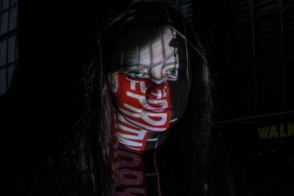
Caitlyn Howatson - Worlds Within Worlds For my Final Major Project, I have chosen the theme 'Worlds within Worlds' as I feel that there are many different ways to interpret and work with this theme. The way that I view this is inside every person's mind, there is a smaller world of their own that they have created over time so I will try to reflect this throughout my work during the 11 weeks we have been given to complete our projects. During the 11 weeks of this project, I will be working around producing high quality, multiple exposure images that will then be printed off A2/A3 sized and mounted onto an exhibition for the end of the course. I will also be presenting my final images in an A4 Hardback book which I will place onto a plinth at my exhibition. This book will include the images that I have mounted as well as other images from my project. I also have to choose 3 artists to use as influences for work that I will be producing. The artists that I have chosen for my work are Luke Gram, Dan Mountford and Robert Brownjohn. The reason I have decided to use Luke Gram and Dan Mountford as artists which will influence my work is because both Luke Gram and Dan Mountford's work is based around Multiple Exposure Photoshop edits which I will also try to experiment with. |
However, I have also chosen Robert Brownjohn because his work for 'Goldfinger' is based around projection and that is also something I would like to experiment with during this project. During my FMP, I will be using Adobe Lightroom to edit my first batch of images and then export them over to Adobe Photoshop to then layer my 'On Location' landscapes over the top of my portraits to create the 'Multiple Exposure' edits. To achieve a faded kind of look when layering the two images together, my choice in blending mode has to be thought about carefully otherwise it will not turn out the way I am aiming towards. When I have completed my multiple exposure edits in Photoshop, I will then move on to using a projector in the college studio to create the next batch of images. During the projection shoots, I will be projecting landscape images from a Manchester shoot which I plan to go on. When editing these images in Lightroom, I will have to focus on turning down the exposure as the projector will be extremely bright. Towards the end of my FMP, I plan to self-review my work as well as ask my class and tutor(s) to peer review it so I can receive analysis from different point of views other than my own. I also plan to look back at the artists I have chosen as my influences and analyse if my work reflects this. |
 |
||
 |
||
 |
||
| - - - - - - - - - - - - - - - - - - - - - - - - - - - - - - - - - - - - - - - - - - - - - - - - - - - - - - - - - - - - - - - - - - - - - - - - - - - - - - - - - - - - - - - - - - - - - - - - - - - - - - - - - - |
 |
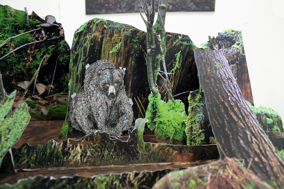
Ada Didsbury - The Bear For this project I wanted to make a 3D book created entirely out of photographs which captured my love for the outdoors. In order to do this I first completed a lot of research for landscape photographers who specialised in woodland and forest to help me understand the types of photographs I wanted. Secondly, I researched artists who created tunnel/pop up books and then designed a concept of what I wanted my 3D model possibly look like. With this I planned my photography in various suitable locations before completing the photoshoots, I did not have many issues, despite battling with the weather at one point. However, I did use it to my advantage. Once the photoshoots were complete I was able to decide on which photos I wanted to edit from each shoot based on the sketch plan I had made previously. I documented the process of the editing and included it in my work. |
This then led to the edited photos being printed at Top Print. I was then able to look through my images and start to make a clearer plan for my final piece for the exhibition linking it to my story. I also completed my illustrations of the bear. Although I had a plan and a story for my FMP I found I did not always think to link the photographs to the story I had written, in future I will ensure I have a copy of the story with and actively look for scenes that illustrate what I wanted to achieve. On this project I found that I had taken lots of photographs which inspired me on the shoots however I found I had lots photographs with no real purpose for them. I have improved on my time keeping but feel I still need to work on this in the future. |
 |
||
 |
||
 |
||
 |
||
 |
||
| - - - - - - - - - - - - - - - - - - - - - - - - - - - - - - - - - - - - - - - - - - - - - - - - - - - - - - - - - - - - - - - - - - - - - - - - - - - - - - - - - - - - - - - - - - - - - - - - - - - - - - - - - - |
 |
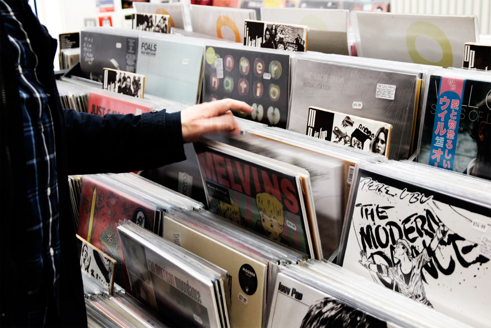
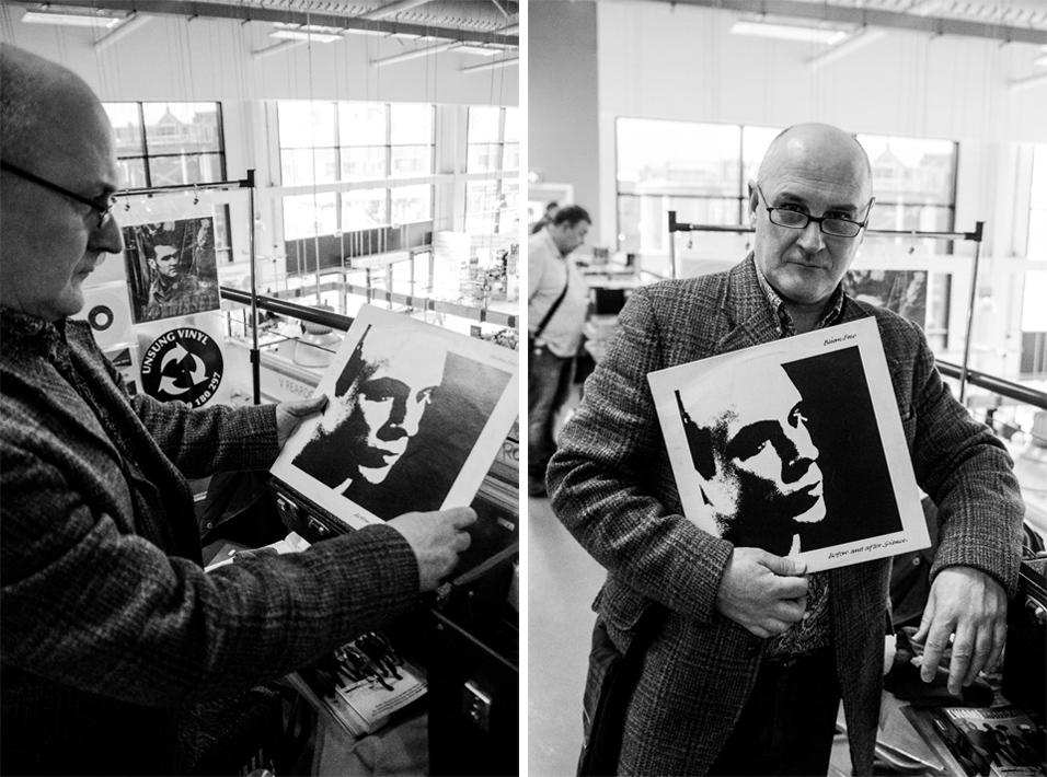
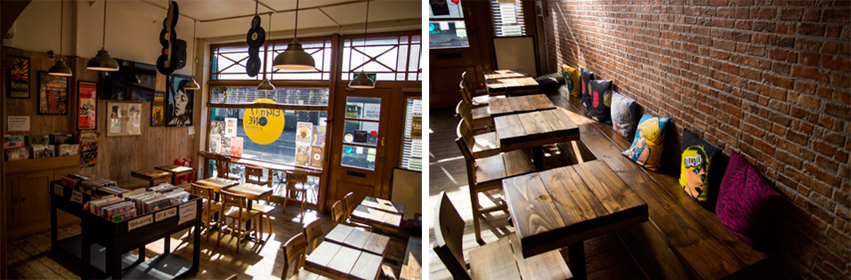
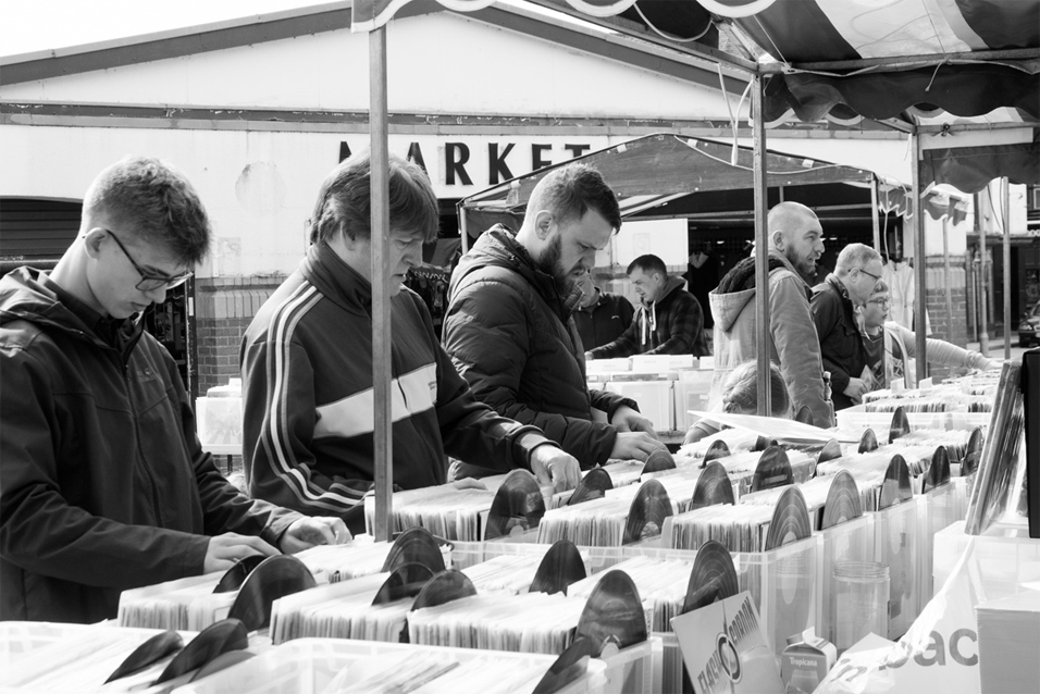
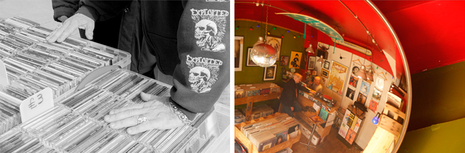
Niamh lafferty - Fusic 'Fusic', sight and sound. Fusic being a combination of fashion and music, in which we see and hear. I plan to create a series of images, some based around music (Record fairs and Shops) and some based around street fashion. I want to ask as many people as possible if they think the music they listen to can influence their fashion sense. I also plan to ask people to write down their favourite lyric or song and explain why its sense of meaning to them. |
As I am influenced by music and fashion of the 80's and 90's, I would like to explore how age may effect certain fashion/music styles and tastes. (Starting points = show evidence of research towards upcoming record fairs, as well as general planning) Chosen artists, their style of photography (x2B&w and 1 Colour) Contextual references = certain articles about music and fashion in 2019. |
 |
||
 |
||
 |
||
 |
||
 |
||
| - - - - - - - - - - - - - - - - - - - - - - - - - - - - - - - - - - - - - - - - - - - - - - - - - - - - - - - - - - - - - - - - - - - - - - - - - - - - - - - - - - - - - - - - - - - - - - - - - - - - - - - - - - |
 |
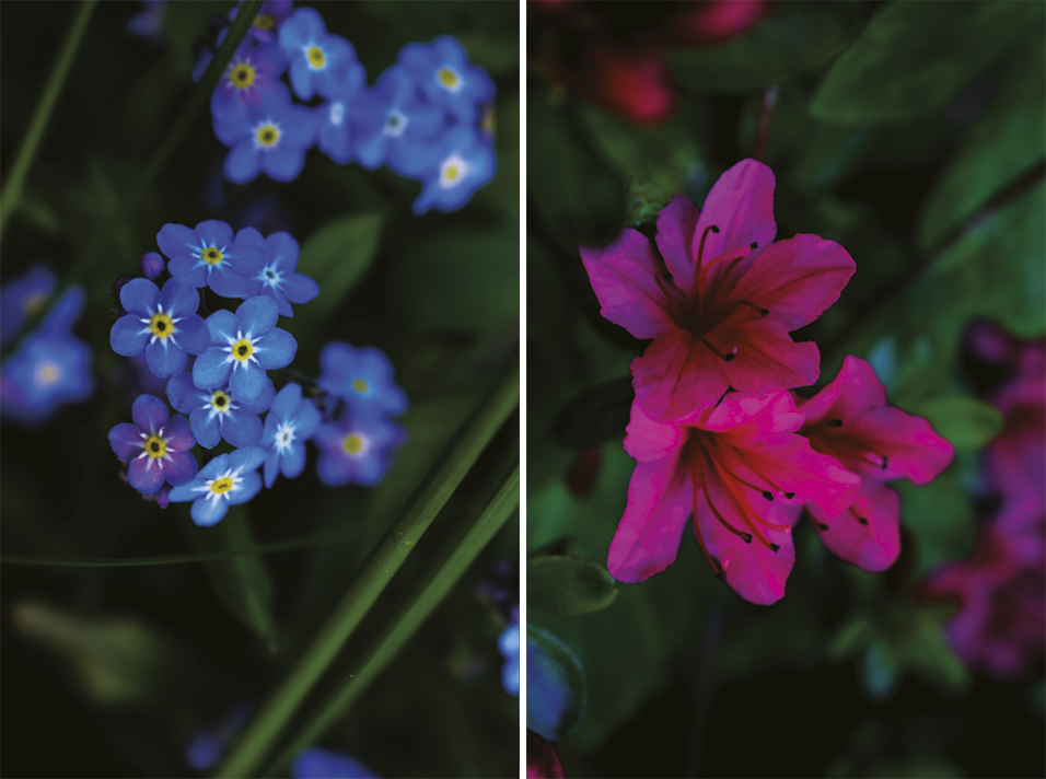
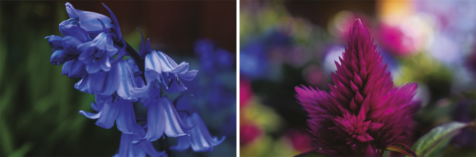
Hannah Lally - Colour in Macro For my project, I wanted to experiment with a kind of photography I have never done before, so I chose macro photography, and I wanted to combine it with a topic that I am both familiar with and something that I enjoy so I have chosen to do macro flower photography, in the theme of ‘Colour’. The three photographers I chose for my artist research is Jacky Parkers, Patty Hankins and Kathleen Clemons, and they all focus on the different details and structure of flowers, and they all take an artistic point of view of nature, seeing it as a part of nature’s beauty and serenity. |
For my shoots, I was thinking of doing a few photoshoots at garden centres and considering my grandmother always buys flowers for her garden, I considered doing shots of them also. In addition, I also wanted to do a professional studio shoot with the correct equipment, including a macro lens for my camera to really zoom in and capture the intimate details of the flowers. I had a plan of using either paints or a water tank for more of an effect but then I changed my mind, since I realised I wanted my images to have a more natural effect, giving the message that the real beauty of nature is all around us, not in a studio. I have created really close and intimate detail and dimension within my images, and I believe I have made my message clear through my final outcome. |
 |
||
 |
||
 |
||
 |
||
 |
||
| - - - - - - - - - - - - - - - - - - - - - - - - - - - - - - - - - - - - - - - - - - - - - - - - - - - - - - - - - - - - - - - - - - - - - - - - - - - - - - - - - - - - - - - - - - - - - - - - - - - - - - - - - - |
 |
Jamie To - Agglomeration For this project, I am using the theme patterns/textures/collections. Through this I have whittled down that I would like to delve into something called agglomeration. This is about collections, masses of objects etc. |
I have found that the work of artists like Sam Kaplan, Jim Golden and others are really inspiring for this topic with their work. |
 |
||
![]()